
This barber's shop is near the Art College - I can help but think that one of the student's got themselves a year of free haircuts for this effort.

As Britain's mustard capital there are plenty of mustard-related businesses in Norwich. I like the crazy up and down nature of the lettering.

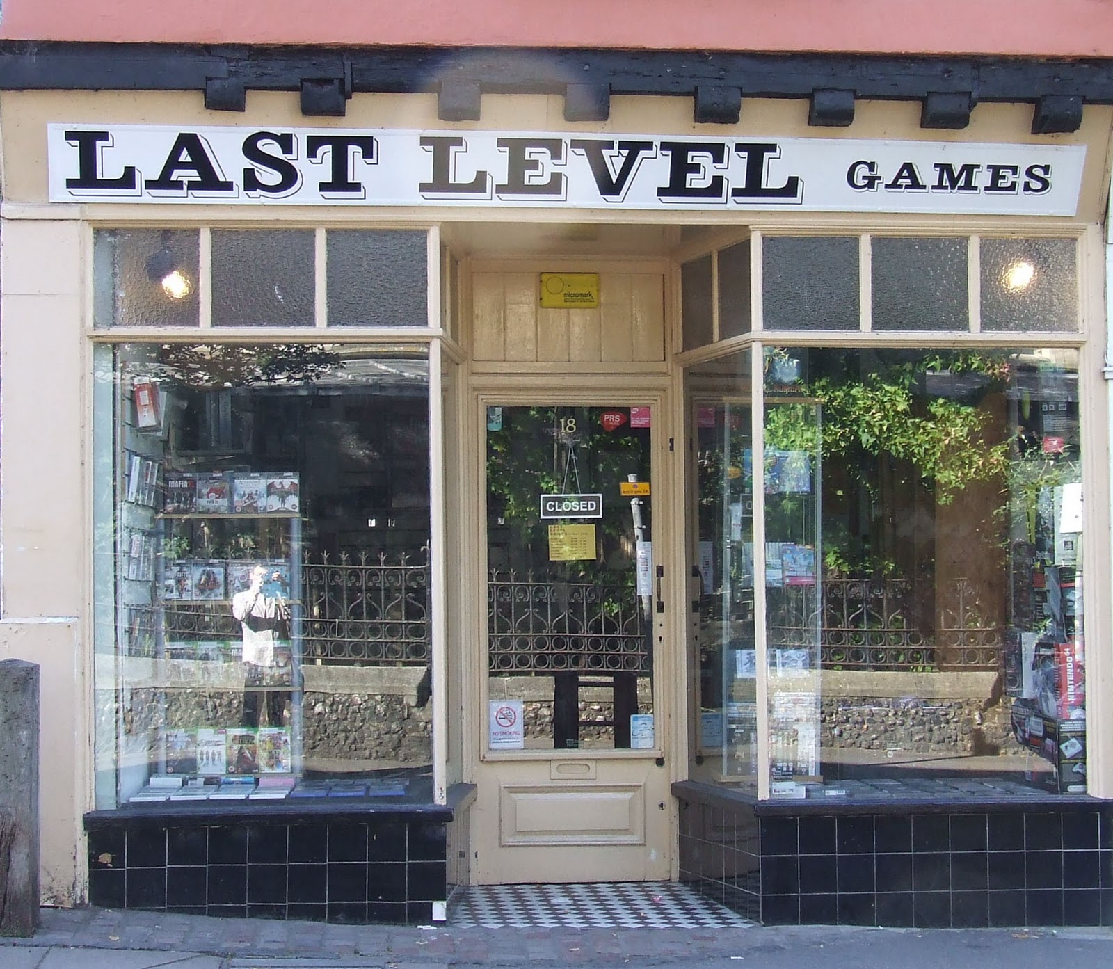
Very understated effort nicely in keeping with the architecture. Dropped 's' keeps it interesting.

Fun and cheerful. Jasper is a cat and the type reflects the jolly, fat cat, feline theme of the cafe.

The typeface certainly make this Thai stand out. Lettering reminds me of those old black and white pub price boards with the stick on letters.

I like the fact that the lettering on this pub is painted onto the wall of the pub itself. Good colour scheme too.

This small shop selling joss sticks and the like is a bit of an institution. Lovely Art Nouveau typeface with the skyline of Norwich cleverly worked into the pattern.

Sister shop of Head In The Clouds maintaining the Art Nouveau feel.

An odd choice. Typography initially unremarkable but it suits perfectly this Labour working mens club - reminds me of the fantastic lettering, colours and patterns of the banners of miners and brass bands.


I've always liked the way this shop is presented. Not so much the typography on the main sign that works - more the lettering of the window display.

Inside, this cafe has really gone with a Parisian Art Nouveau feel and this is reflected in the classy gold on black typography.

On reflection this one is a bit dull. Given the fact it is an art shop they could have had much more fun and still retained their classiness.
Simple, unfussy design - if they had fully gone with the space invader theme could have been really impressive.

Fun lettering is perfect for this stag/hen party shop.

Bold, uncompromising lettering is absolutely perfect for this record shop.

Although the typography is a bit different I always think it would be better suited to a coffee shop. The swirls of the 'a' look like milk being poured into coffee. Cream and brown colour scheme probably add to this impression.

Comic sans is horribly over-used but I like this, particularly the alternating colours and babies at either end.

Another coffee shop with a nice, simple, homely design.

Interesting to compare this with Circular Sound. Great window space that, for me, is totally wasted - visually, the typeface is ugly and unremarkable - like something you'd find on cheap VHS packaging from the eighties..

I love the simple, understated nature of this sign - perfectly in keeping with the ethos of this 'green' cafe. Very tofu and sandals.
No comments:
Post a Comment