 |
| Simple and effective. Really like the tones used underneath the title and it contrasts beautifully and effectively with the author's name beneath. |
 |
| One of the much admired cannon gate bible covers. So much to admire about this. The photograph is fantastic. I love the thin horizontal line dividing book details and the use of orange for the title which contrasts well with the white used in the rest of the type. Text is nicely balanced with both left and right justified. Typography is suitable simple - great idea to use lower case. |
 |
| Great cover. Author, title and quote packed into the cover, stacked like pieces of wood - mixture of upper and lower case add to this impression of pieces being stacked. Echoes the tough spirit of the novel, |
 |
| Another beautifully simple cover - from 1922. Love the fragile white typography on the azure blue background: suitably, feels like sailing into the unknown. |
 |
| Used to really like this cover but now not so sure about the darkness and the fact the title sits under the author in same size type. |
 |
| Really like the prominence of the quote here. Black, white and red mixed with silver create a darkly glamorous image. Love the skulls too. |
 |
| Another silver, white and red cover. Great idea replicating the side of a plane. Bold and eye-catching. |
 |
| Glitzy, glistening, silver cover is perfect for this hhedonistic novel heat-soaked novel. Love the clever line of cocaine through the Is of the title. |
 |
| Loved Penguin's Twentieth Century Classics designs. I always liked the way the black and white photograph echoing the subject matter contrasted with the mint-green spines and back covers. Very uniform but created a strong image/brand. |
 |
| And here is an example of it's counterpart for penguin classics. Loved the cream border against the black background of the title/author. I think the tone and composition of the picture work particularly well with the format in this example. |
 |
| A more recent penguin classics design. Great picture - the greens, reds and bits of blue contrast well with the silver, white and black carrying the title/author/publisher. |
 |
| Famous cover. It's the strangely cheerful use of colour I like here - particularly the way it isolates and emphasises the mechanical black and white of Alex's eye. |
 |
| Not as iconic but I prefer it. Simple, bold idea echoing the milk bars of the novel. Works wonderfully well with the Modern Classics format. Really (like the.white band, the typography, the way it separates picture and book information and splash of orange of the Penguin logo. |
 |
| Soft, warm, lush colours that you can wallow in -just like the work itself. |
 |
| Vintage classics have really raised the bar for me. The covers are diverse - photographs, illustrations, cartoons, etc - and yet they retain a strength of brand through the VINTAGE AUTHOR type across the top of each book and matt covers. |
 |
| Beautiful illustration. |
 |
| Fantastic illustration capturing the flavour of the novel. |
 |
| best of the lot. Lovely tones, great typeface that doesn't underestimate the buyer/reader - cover sets a puzzle that draws you in and makes you more likely to want to buy it - or at least find out what the novel is about. |
 |
| One of my favourite covers for one of my favourite books, once again from Vintage. Love the contrast between the author typeface (I love the breeze-block effect colouring) and the grafittied title scrawled underneath he illustration of the isolated tower block. Colours are fantastic: rich, bloody, dark, unpleasant. |
 |
| One of my personal favourites. As with the Amis cover (above) great use of red, white and black tones. Very simple but effective. |
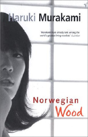 |
| Uses so many components I like. Simple black and white photograph, orange text (for title) - and I love the handwritten style of the word 'wood'. |
 |
| These were a great series of covers. Quirky illustrations that didn't make much sense, |
 |
| Intriguing photograph - where, what, why? - draws you in. Focus kept on this by the simple, white typography that almost blends into the sky with the clouds. |
 |
| Simple and effective - the Soviet and American flags as pieces of the political jigsaw. |
 |
| Great idea tying in nicely to the theme/subject matter of the book. |
 |
| Brilliant, clever use of photography/Photoshop. Unsettling, creepy and arresting. |
 |
| Bold use of colour and symbols really catches the attention while still managing to get the basic details across. |
 |
| Like the 'Great Apes' cover, another really good example of just going with a good idea. Great novel, too. |
 |
| A cover that really communicates the mood of the era and the novel. Great idea to split the title with the author's name. I love the boldness of filling the cover with the GB84 and the way it is made up of red, white and blue and set on a black background - the gold of the author's name works really well, too. |
 |
| Slightly different cover for the paperback but no less effective. Red, white and blue now completely dominate. Overall I prefer he hardback, if only because of the use of gold and the way it draws my attention. |
 |
| A beautiful cover for 'On Beauty'. Love the patterns used, especially the fill for the author's name. I also really like the way the two patterns are balanced by the dark brown fading to black of the background. |
 |
| A recent Modern Classics cover. Love the mellow, warm tones of the background photograph - would like to have seen even more of this and a slightly smaller type - particularly for the author name which would have been better moved to the top of the photograph. |
No comments:
Post a Comment